Ocean Relaxing Station is a local massage business in San Luis Obispo, California. Known for their excellent service and strong reputation in the neighborhood, they previously had a limited online presence.
I helped them establish their digital presence by designing their logo, selecting a color theme based on their preferences, and developing a customized website to showcase their services. The website not only attracted new customers but also effectively promoted their newly introduced services.
Logo Design
Concept & Inspiration
The logo for Ocean Relaxing Station embodies the essence of tranquility, nature, and premium wellness services. It was designed to visually communicate the brand’s identity, incorporating elements that symbolize relaxation and a soothing oceanic experience.
Design Elements & Meaning
Ocean Waves: The flowing waves in the logo emphasize the brand name “Ocean,” evoking a sense of calmness and fluidity. This visual representation reinforces the relaxing and rejuvenating atmosphere that the business provides.
Business Name Integration: A clean, modern, and professional typography was chosen for the brand name that brings same feeling that this business wants to provide.
Hot Stone Representation: Smooth stones resting on the seabed subtly highlight the business’s free special hot stone massage service. This element enhances the visual storytelling of relaxation and therapy.
Sun Element: A small sun in the corner symbolizes warmth, positive energy, and rejuvenation—key emotions the business aims to provide for its clients.
Color Palette
The chosen colors reflect the calming, natural, and refreshing theme of the brand:
Primary Colors:
#1D3642 (Deep Ocean Blue): Represents trust, professionalism, and relaxation.
#87C2DE (Sky Blue): Symbolizes serenity and a refreshing coastal breeze.
#FAFAFA (Soft White): Maintains a clean and elegant contrast.
Complementary Color:
#FFCB22 (Warm Yellow): Adds a touch of energy, warmth, and approachability, balancing the cool blue tones.
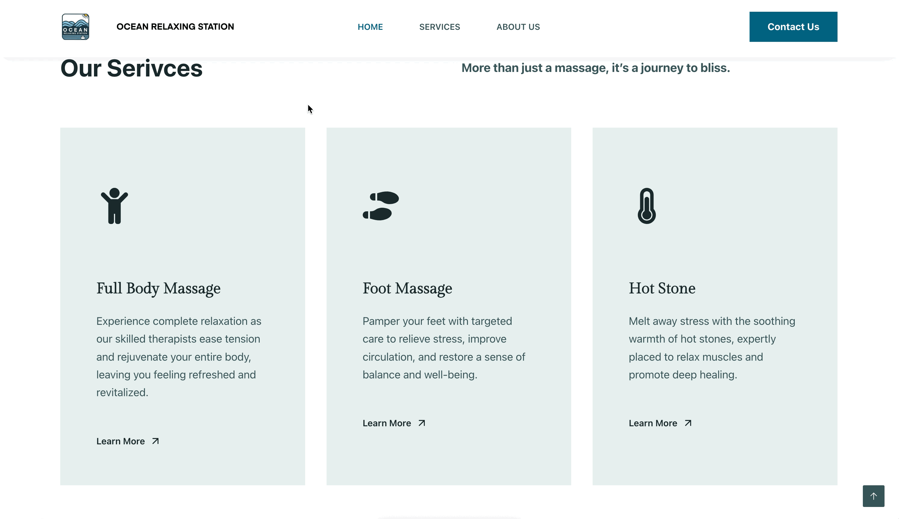
Website Design
The Ocean Relaxing Station website is designed with a refreshing oceanic theme, utilizing a blue and white color palette to evoke a sense of tranquility and relaxation. The layout is clean and modern, ensuring an intuitive user experience.
Service cards are dynamically designed with interactive hover effects, revealing images that visually represent each service, allowing visitors to get a preview of what to expect.
To enhance accessibility, the website seamlessly integrates Google Maps and a contact form, making it effortless for customers to locate and reach out to the business.
Live Google Reviews are displayed on the site, providing real-time customer feedback and building trust with potential clients.